DESIGN ENHANCEMENT OF THE SOCIAL NETWORKING APP
What is CLIQ?
In an age where technology allows people to meet online, it’s still difficult to find and connect with people you really ‘CLIQ’ with.
The CLIQ social media mobile/tablet app was launched in the UK in 2023 to address this issue. It allows users to get to know like-minded people by chatting to individuals, joining clubs and/or attending events based on the user’s selected interests.
CLIQ now wishes to enhance the experience of its users by identifying possible areas for improvement and optimising the design features of the app based on their findings.
Let’s take CLIQ app to the next level!
ROLE
UX RESEARCH, UX DESIGN, UI MOBILE DESIGN
TIMELINE
3 MONTHS (DEC 2023 - FEB 2024)
SOFTWARE
FIGMA, ILLUSTRATOR, MIRO, GOOGLE FORMS
DISCLAIMER: All CLIQ app mobile screen images and videos used in this case study are my own creations. All new CLIQ app designs are my creations except for those designs indicated as having been provided by CLIQ. All current CLIQ app mobile screen images and videos have been replicated by me in Figma from the existing CLIQ app (and not provided by CLIQ directly). Mobile screen images of competitor mobile apps have been obtained from screenshots of the apps concerned. Images included in all CLIQ app mobile screen images and videos are from Freepik Figma plugin. Illustrations in Approaching the right people at the right time and Who are CLIQ’s users? sections are from Freepik plugin and have been altered using Illustrator. Existing icons are from CLIQ and new icons have been taken from The Noun Project. For the purpose of this case study, only iOS mobile devices have been considered, however the new designs and features could be transferred to mobile Android OS and iOS/Android tablet app versions.
Approaching the right people at the right time
To build my UX portfolio, I had the idea of creating an app for a non-profit girls walking club to manage their events.
As it turned out, the club was already using an existing third party app for this purpose...
So I decided that, rather than creating a whole new app, it would be a better idea to collaborate with the creators of the existing app, CLIQ, to see how the app might be further developed.
I contacted the founders of CLIQ, Jason and Nicola, via LinkedIn who kindly agreed to meet with me to discuss my ideas and designs.
The outcome was a positive one and resulted in a fruitful collaboration!
What do we want to accomplish?
Identify opportunities to enhance the app through improved usability or new features
Simplify user navigation
Make key functions more accessible
Enhance the user interface
Increase the app’s security features for users safety
Bring new users onboard
Ensure user retention and long-term engagement
How was this achieved?
To gain feedback on how users feel about the current app and identify opportunities for enhancement, a survey was created and sent to a sample of the app’s community leaders and people who use the app to find clubs and events. Contextual inquiry with new app users was also conducted. The main pain points identified are shown below.
User needs and struggles
Onboarding
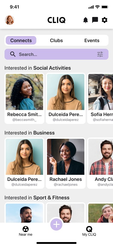

Next page (Near Me Connects)
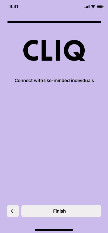

Last Sign Up page
“I wish it had a tutorial to guide you through the apps features and how to use them”
“It’s weird how the first page you see once signing up is people’s faces, when I’m more interested in seeing clubs in my area”
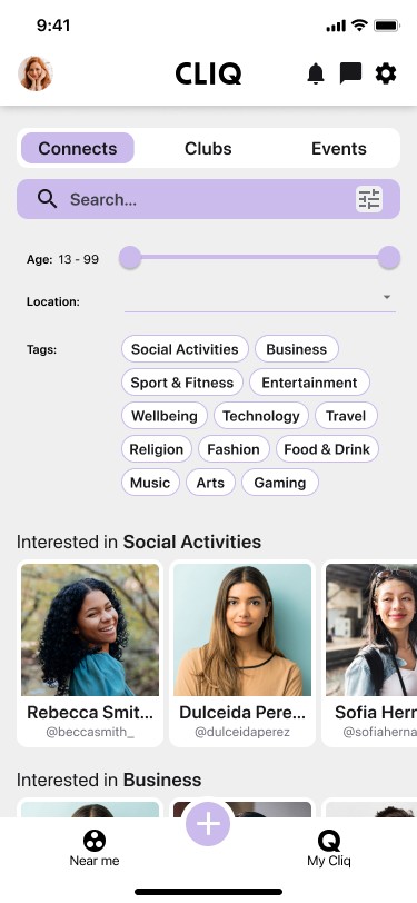

Filters


Location filter
“I find the filter wording too small”
“It’s quite annoying how the keyboard covers most of the list of location names [when filtering], makes it hard to find your location”
“I'd like to be able to select multiple locations because for example, I would like to select Southampton and Portsmouth because they're both near to me and I would want to be looking at both”
“When I filter by location, I get results from other locations”
“More [interest] tags in filters would be good”
Near Me
“I find the interface a bit confusing and overwhelming. There's a lot going on in one screen”
“I find the word “Connects” a bit confusing”
“Duplicated entries for people/clubs/events on the respective pages are annoying”
“No option available to follow people on profile cards”
“Not enough information about clubs on club cards”
“No calendar option for displaying events”
The ‘Near me’ page that users find most useful is Clubs (59%), followed by Events (35%) and Connects (6%)
“Connects shouldn’t be the first tab”
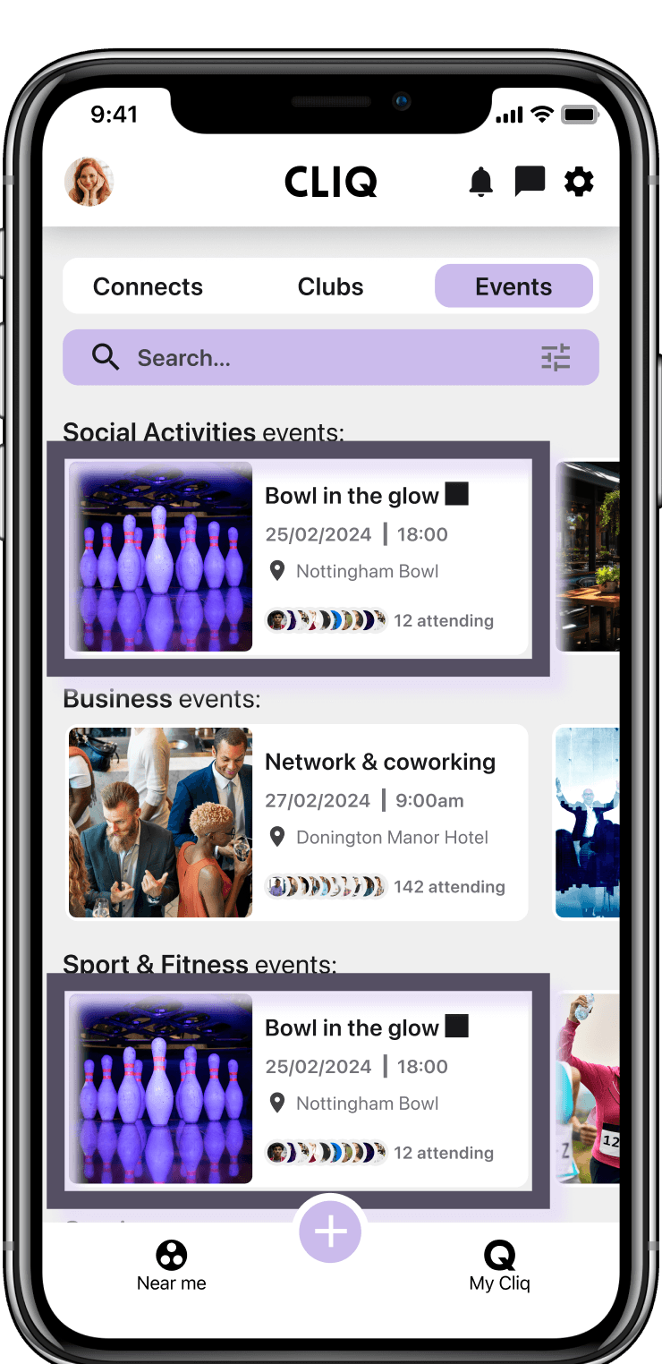
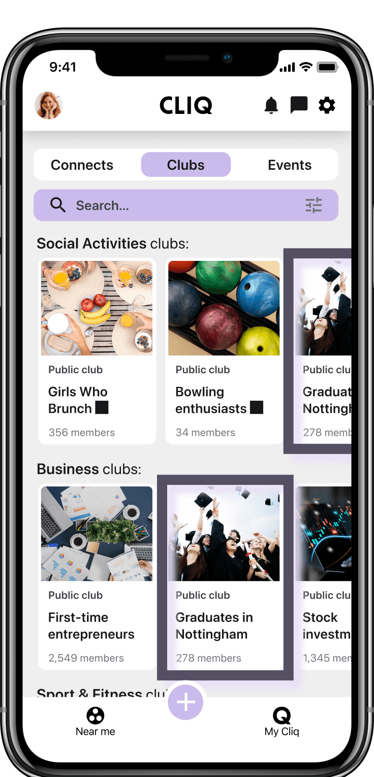
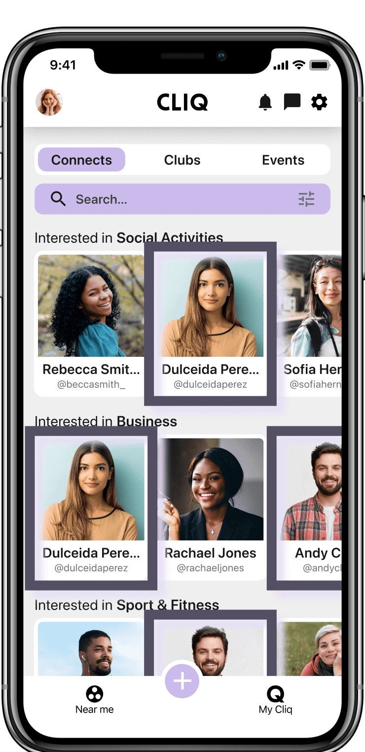
Connects
Clubs
Events


“There is no way of keeping club member & event information hidden from non-members in private clubs”
“Need somewhere to post for groups that isn’t a chat”
Display club events in calendar format
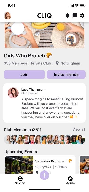

Join
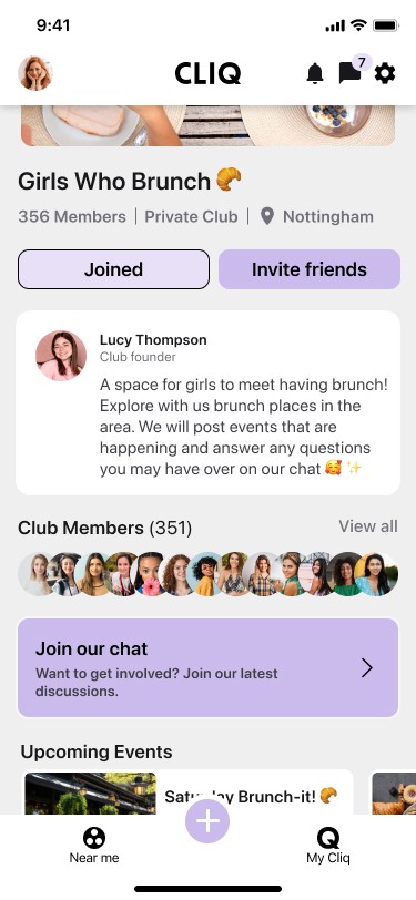

Joined
Join a Club
Create an event
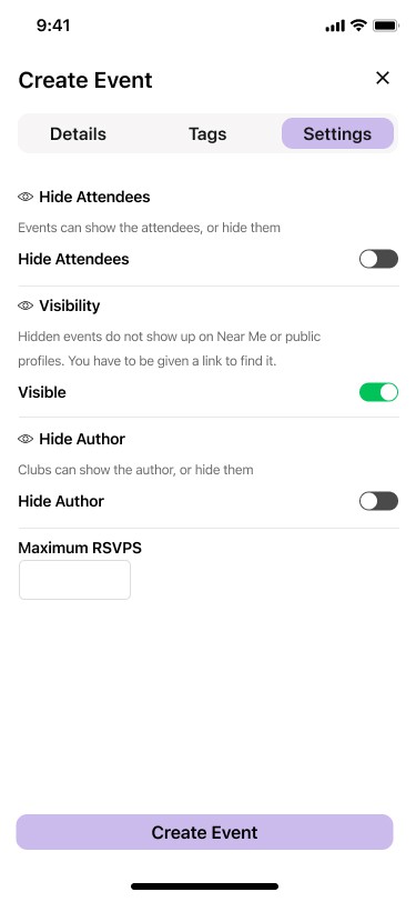

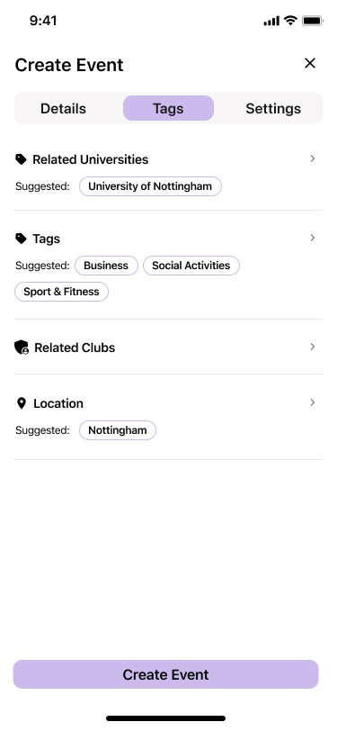

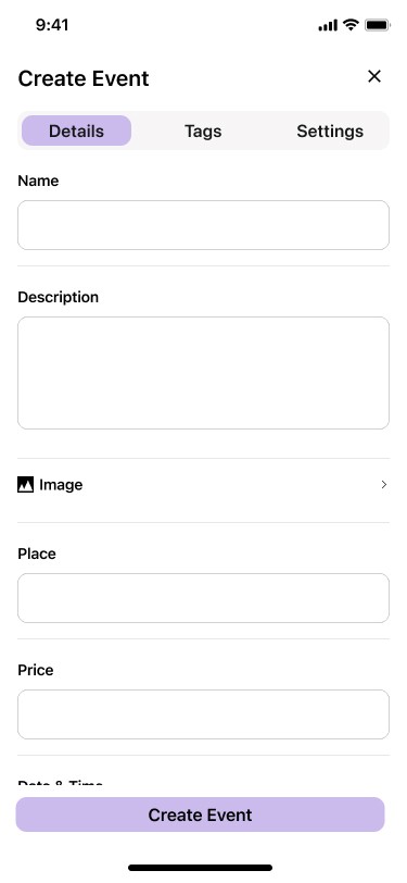

Details
Tags
Settings
“Not being able to schedule event publications. This created a MASSIVE headache for the group”
“It would be great if you could send reminder notifications for events I have registered for”
Include an interactive map with the location of the event or route (if it's a walk or run, for example)
Chats
“The club chat should be simpler, maybe group chats by club, because I’m in a lot of chats and it’s hard to keep track”
“I can’t mute chats to avoid chat notifications of those I’m not interested in”

Heuristic Evaluation
A heuristic evaluation of the current version of the CLIQ app was conducted using Jakob Nielsen and Rolf Molich’s 10 Usability Heuristics. This evaluation highlights good and bad aspects of the user interface design that may or may not have been picked up in the user research, and hence highlights further design opportunities. Below are some of the results from the heuristics analysis.
Visibility of system status
Progress bar in Sign Up pages


Icons are not marked when the respective pages/sections are selected (Near me, My CLIQ, profile, notifications, chats, settings)


Recognition rather than recall


In Create Club/Event pages, suggested tags that match those in the user’s profile appear and can be selected directly without having to enter each tag field
In Create Club/Event pages, suggested tags that match those in the user’s profile appear and can be selected directly without having to enter each tag field
User control and freedom
“Are you sure” pop-up appears after clicking Joined to leave a club
“Are you sure” pop-up doesn’t appear after clicking ‘x’ to leave the Create Club/Event page


Help and
documentation
No walk-through tutorial pop-ups appear after finishing the Sign Up process


What are the competitors doing?
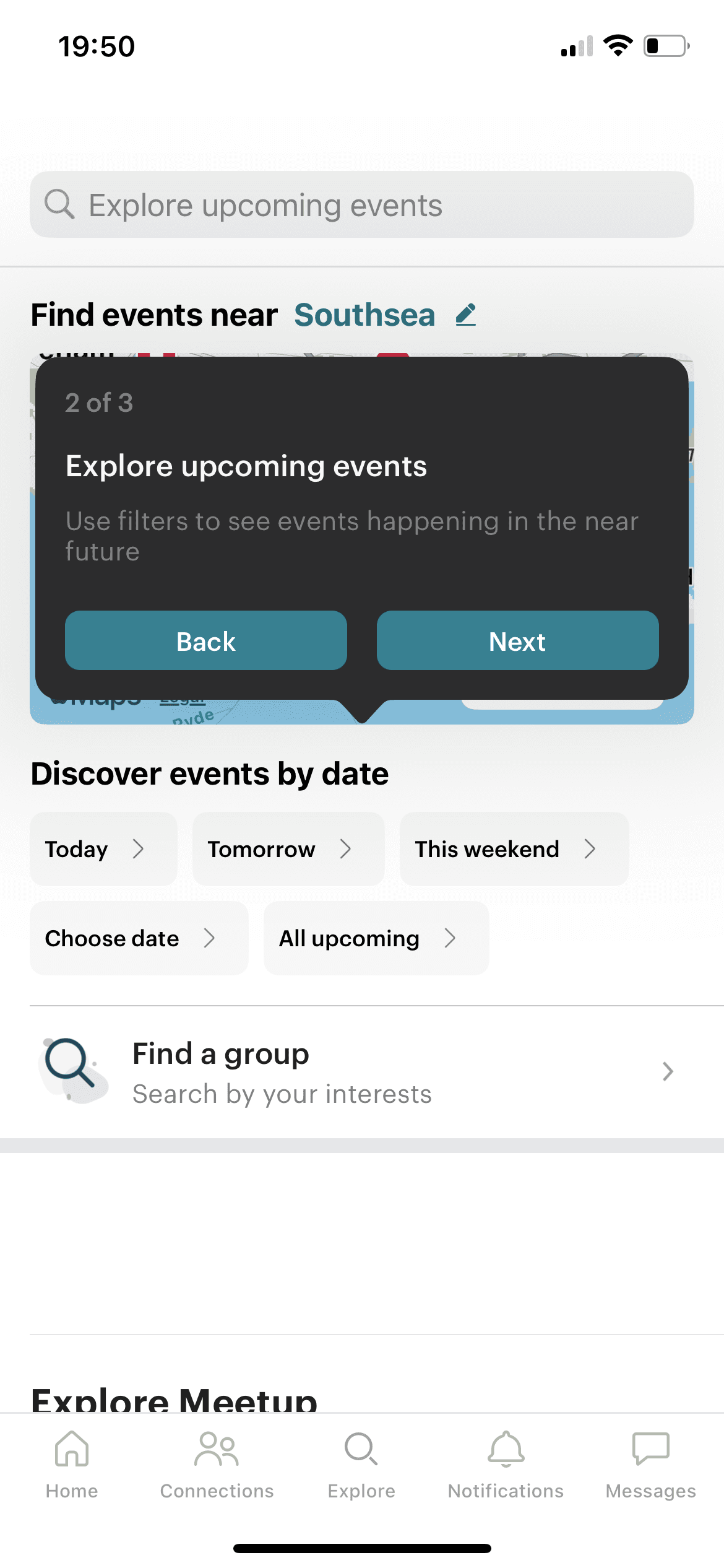
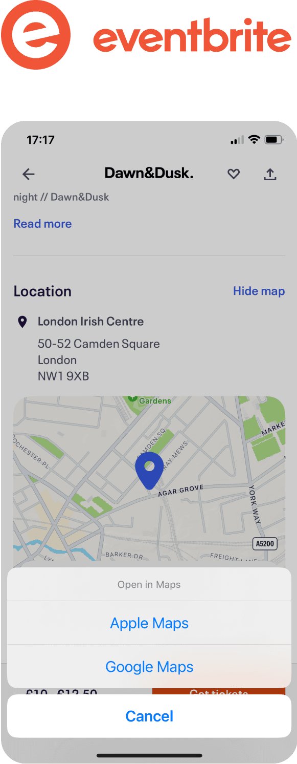
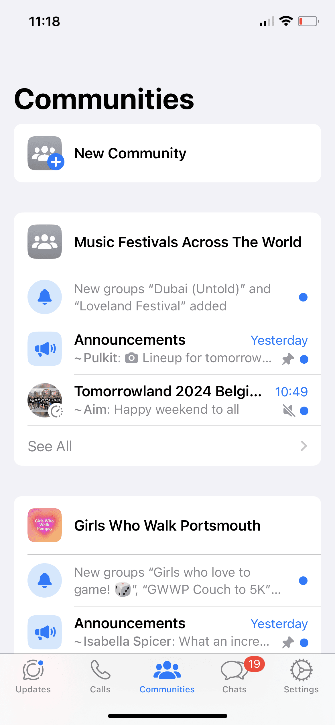
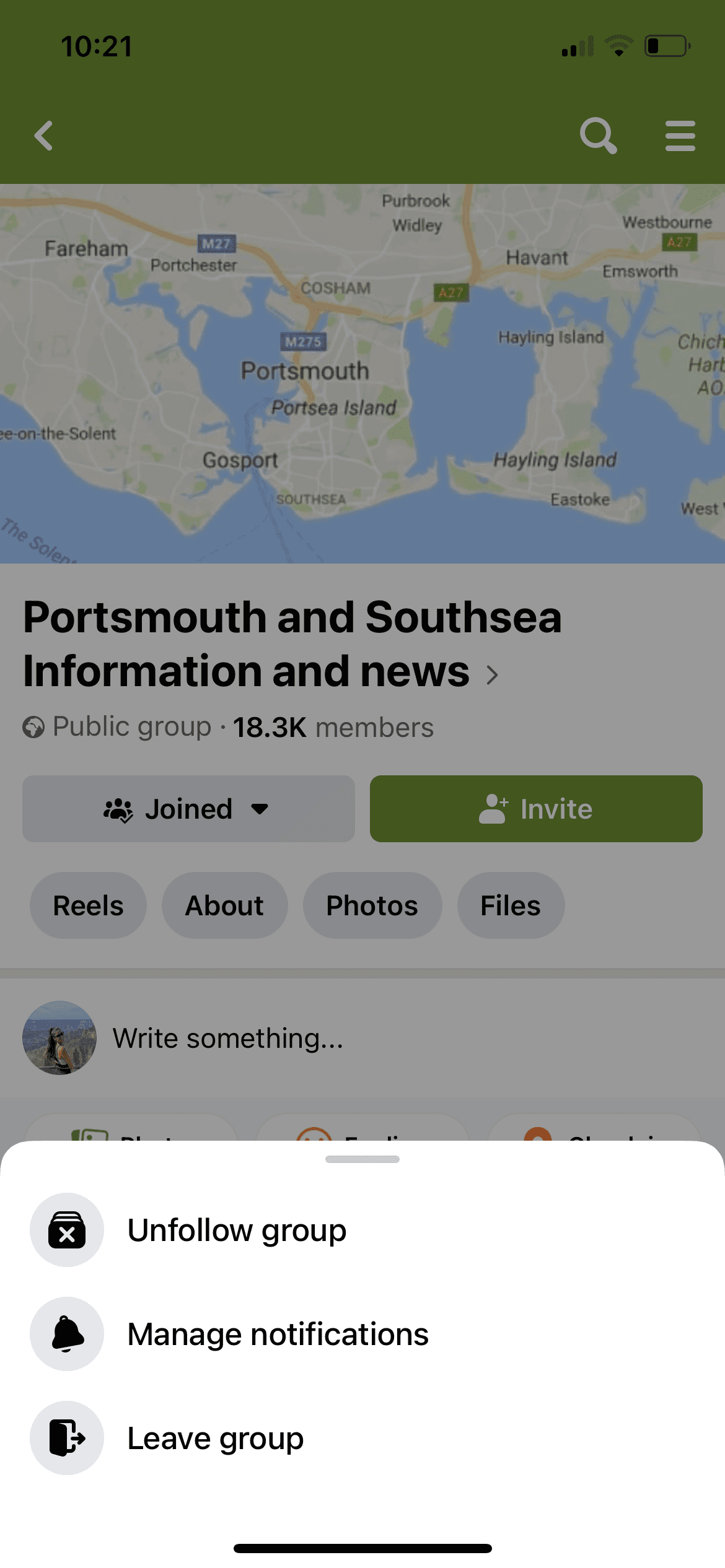
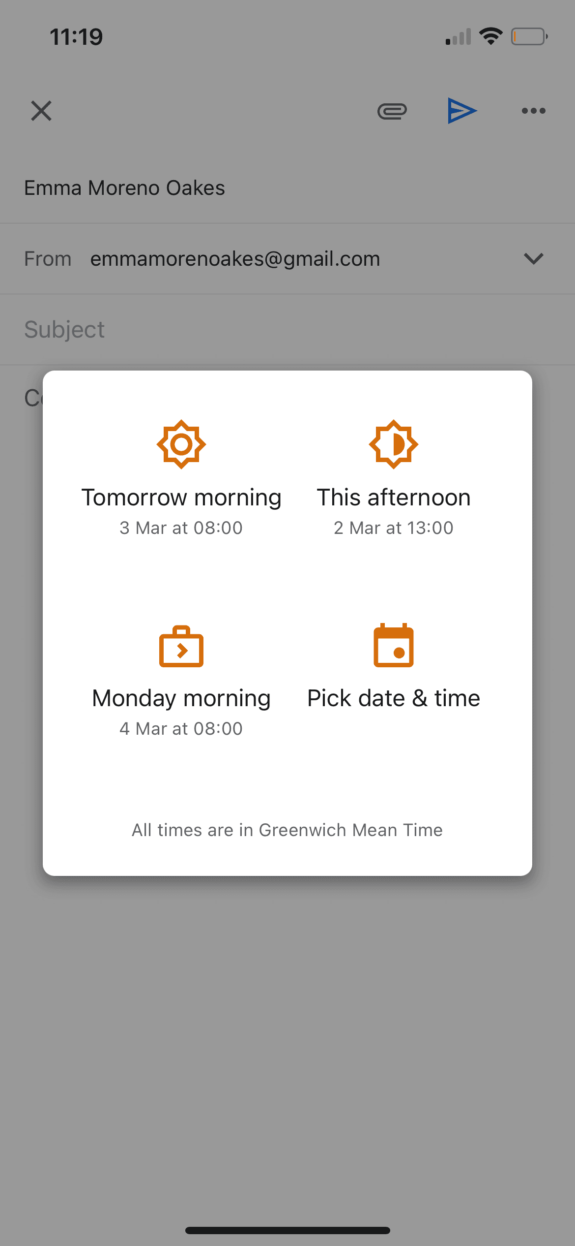
A competitor analysis was performed to gain an understanding of what made other apps offering similar benefits successful. Any missed opportunities discovered were also noted. A numbers of apps were compared against the CLIQ app in relation to a variety of features. Below are some of the successful aspects of the competitor apps together with other areas of the apps that could be improved.
💡 Success factors
Onboarding guidance walk-throughs
Event location shown in map and with link to third-party map app
Chats from the same community are grouped
Icon of the page selected is highlighted
Chat management is enabled (mute, pin, private group chats)
Clear instructions/wording for joining/leaving a group
Possible to schedule a notification to be published at a certain time
👀 Missed opportunities
Confusing and overwhelming interfaces
Excessive steps to reach a desired page





Who are CLIQ’s users?
A persona representing the majority of the app’s user profiles was created - someone with various interests who wants to find and join clubs and events in their area, and who could also become a community leader.

“Building a business isn’t easy when you don’t have the right connections”

“It’s difficult to keep oneself motivated to train for a marathon when you have no-one accompanying you”

“I struggle to step outside my comfort zone and reach out to people to socialise with”
Meet Olivia! 👋
A young professional who has moved to Nottingham, UK, to build her start-up business but has had difficulty settling in.
Olivia would like to meet other entrepreneurs to share ideas with and to be inspired by. She would also like to have a group of friends to socialise with. Additionally, Olivia has managed to secure a spot for the London Marathon this year, so meeting people she could train with would be great!
25 years old
Nottingham

GOALS
Build business connections
Collaborate with others
Run a marathon
Find like-minded friends
STRUGGLES
Networking
Inspiration
Motivation
Self-confidence
INTERESTS
Business talk
Running
Coffee
Cats
How do users navigate CLIQ?
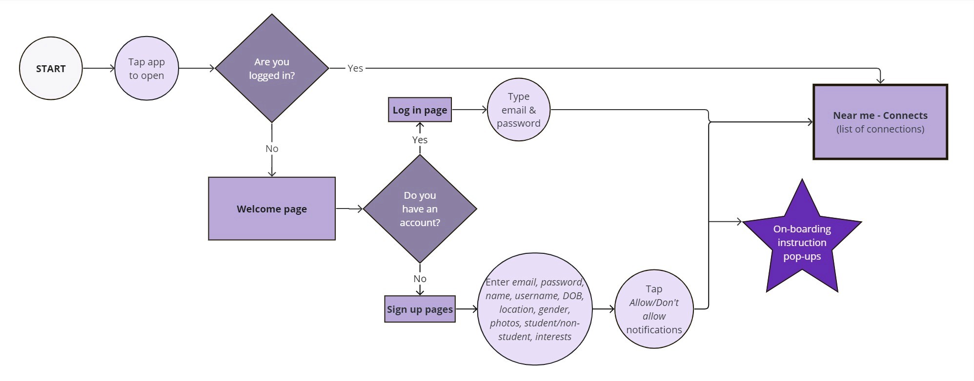
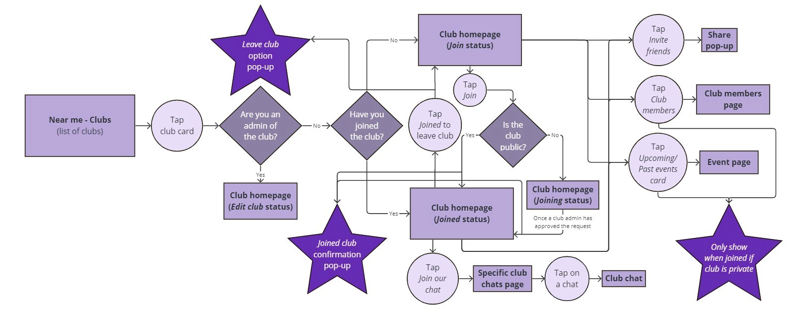
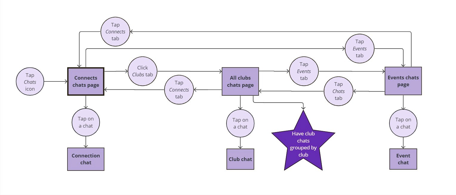
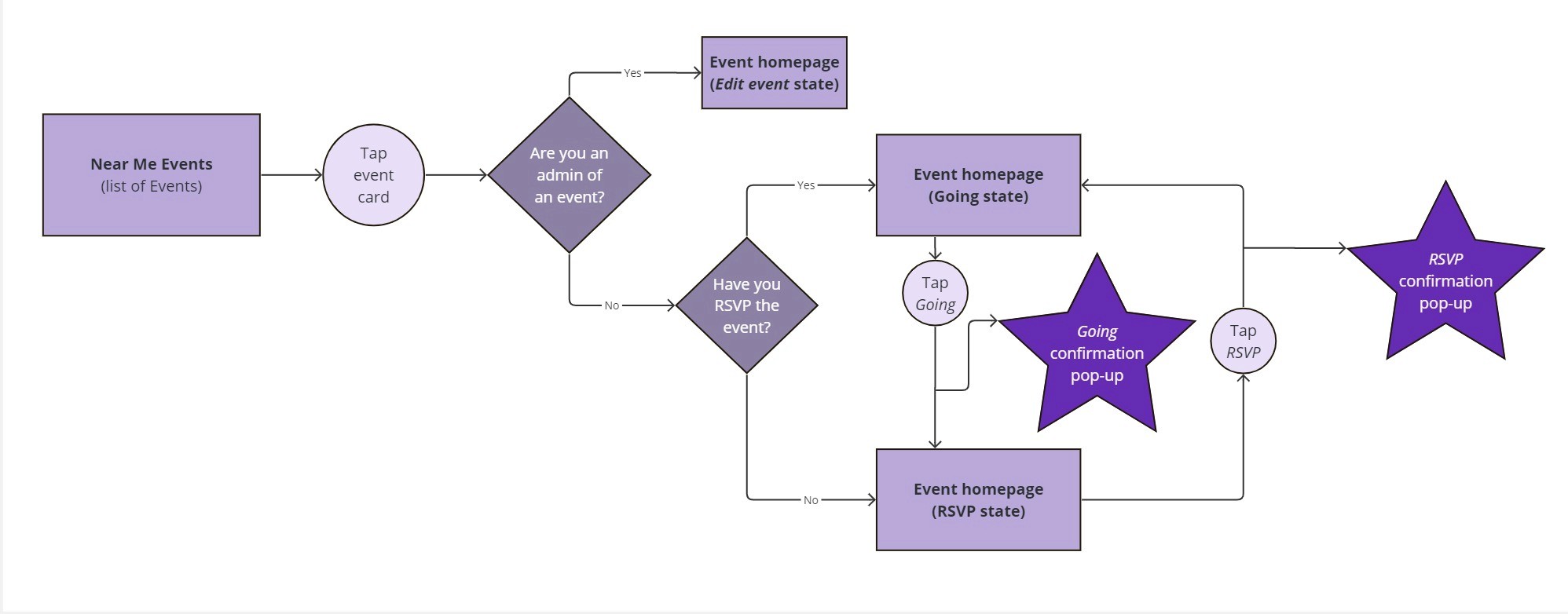
For simplification purposes, only the most common navigation experiences are displayed. The below user flows show how Olivia signs up to the app, navigates the ‘Near me’ pages, joins a club and creates an event. Opportunities to enhance the app’s user flow are highlighted in the purple stars.
User emotions when navigating CLIQ
CLIQ has numerous functions and features that allow users to perform different actions such as find a club, engage with club members, find an event and confirm attendance, ask questions about an event, and chat to others looking for connections. The user journey below shows the stages and emotions Olivia goes through while navigating the app and covers the principal actions that can be completed in the app.
GOALS
GOALS
ACTIONS
TOUCHPOINTS
EMOTIONS
PAIN POINTS
OPPORTUNITIES
ONBOARDING
Sign up and become familiar with the app
Download the app, sign up and navigate through the app to see how it works
Sign up pages.
First page of app (‘Near me’ - Connects page)
Curious
No explanation on how to use the app
Create onboarding guidance steps to introduce the user to the app’s pages and features
NEAR ME
Find clubs, events and connections
Browse and search the ‘Near Me’ pages to find clubs to join, events to attend and people to connect with
‘Near me’ Connects,
Clubs and Events pages
including search/filter.
Individual profile pages.
Individual club pages.
Individual event pages.
Curious, bit frustrated at times
Connects as the first ‘Near me’ page is not useful as the most used ‘Near me’ page is Clubs
The terminology “Connects” doesn’t resonate with people
Confusing and overwhelming interface – too much information visible at one time
Duplicate entries for people/clubs/events are annoying
No option to be able to follow people directly from their profile cards
Not enough information about clubs on club cards
No calendar option to display events
Filter results contain results for locations that were not selected
Filter page wording is too small
More interests tags required in the filter section
Filter location keyboard covers most of the list of locations
Can’t select more than one location in filter section
Adjust the first ‘Near me’ page to be the one most useful for users
Change the word “Connects” to “People”
Make the interface less busy
Remove duplicate people/club/event cards
Provide an option to be able to follow people from their profile card
Add more information about clubs on club cards
Display events in calendar format
Reformat filters page (bigger filter wording, make sure location list is not covered by keyboard)
Allow selection of more than one location in filter section
Include only results for the locations selected
Notify user if there are no results in their selected location & suggest people/clubs/events from nearby areas instead
JOIN A CLUB
Join a club and find out more about it
Join clubs you have found that interest you and read through the information about them
Individual club homepage members page, events page and chats page.
Excited
Members and events information from private clubs is visible to non-club members
No option for members to post club information other than through the club chats
Events can’t be displayed in calendar format
Ensure private club information is not visible to non-members
Allow club members to introduce useful club information for other club members (e.g. FAQs, posts) to reduce number of chat messages
Display club events in calendar format
CREATE AN EVENT
Create and publish an event
Select the create an event option and fill in the fields. Then publish the event
Create an event page
Satisfied
Not possible to schedule the publishing of an event
No option to include event reminders
No option to add an event location in a map or as a clickable link to a third party map app
Add option to schedule event publication
Add option to include event reminders
Add location link/map
CHATS
Read and interact in chats
Once you have joined a club or event, you will receive chat notifications and be able to read the chat messages for the relevant club/event
Club/Events chat pages.
Message notification pop-ups.
Bit confused
Can’t mute chats if required
Clubs chats page is overwhelming and confusing because it contains chats from all clubs the user has joined/created mixed together
Group Club chats by club
Allow users to mute chat notifications
How can we optimise Olivia’s experience with CLIQ?
Brainstorming & design solutions
Various solutions to existing opportunities were developed until a final concept and design were reached. The below examples show a selection of design concepts, iterations and decisions for the “Near Me” and “Club” pages.
ENHANCEMENT OPPORTUNITIES
DESIGN CONCEPTS & ITERATIONS
FINAL CONCEPT
AND DESIGN
Near Me
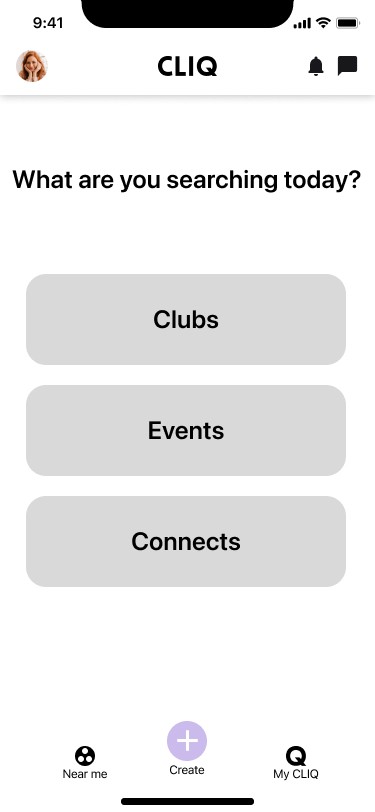
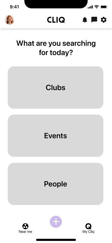
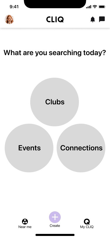
Make interface less busy
Adjust the first ‘Near me’ page to be the one most useful for users
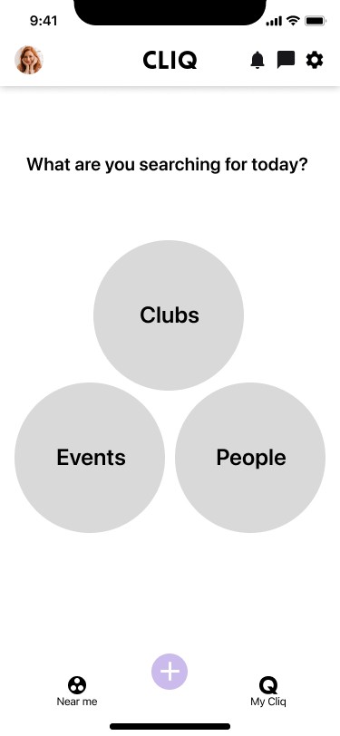
Change the word “Connects” to “People”
Personalise tabs order

Merge all tabs in one page
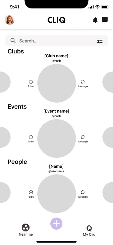
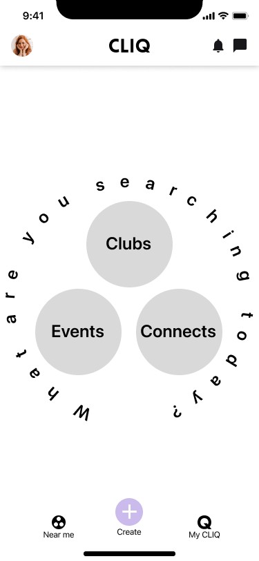
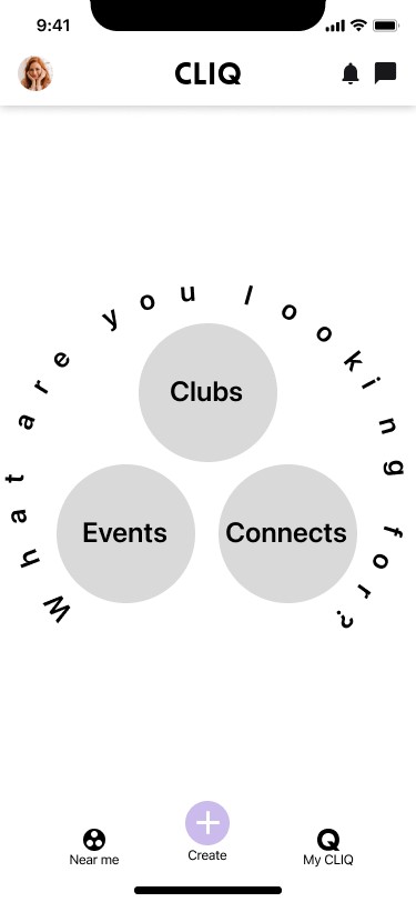
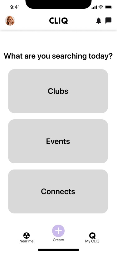
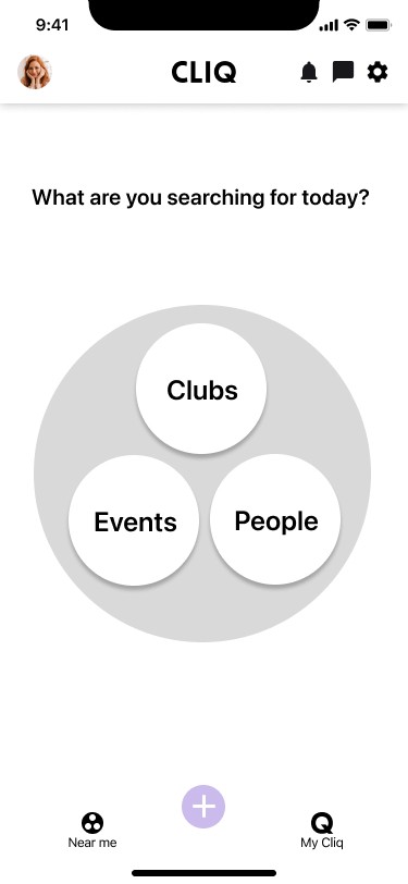
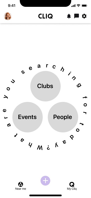
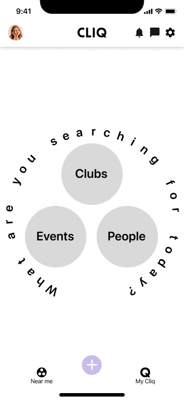
Add a Near me landing page
Final concept
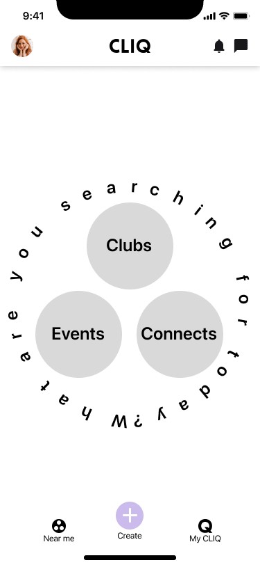
Add a ‘Near me’ landing page before accessing the more detailed info. This provides a less cluttered view for easier selection of the information the user wishes to see.
Final design
The final design for the “Near me” landing page concept (number 5 in the sequence) emulates the ‘Near me’ icon as well as being aesthetically pleasing and easy to read.
Club pages
Allow club members to introduce useful club information for other members (e.g. FAQs, posts) to reduce number of chat messages
Ensure private club information is not visible to non-members
All sections viewable at once.
Events, Members, Posts pages, etc accessed by tapping on the boxes.

Scroll through sections. Section titles stick at top of page. Events, Members, Posts pages, etc accessed by tapping on the relevant section

Scroll through sections, navigation tabs available. Events, Members, Posts pages, etc accessed by tapping the sections or navigation tabs


Final concept
Scroll through sections, navigation tabs available to reach desired sections more quickly if desired
Final design
The final design for the navigation tabs concept (number 5 in the sequence) shows the navigation tabs as a constant feature at the top of the page with the ‘Join’ and ‘Share’ buttons constantly visible, dropping to the bottom of the page for easier viewing when scrolling
(Note: private club info will be displayed as blurred to non-members)
The final result
NOTE: All designs are my own except those indicated as provided by CLIQ, and the following general design features used across most app pages: app background colour (changed from light grey to white) and cards background colour (from white to light grey)
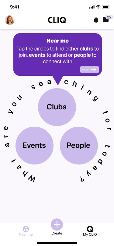

Onboarding 1
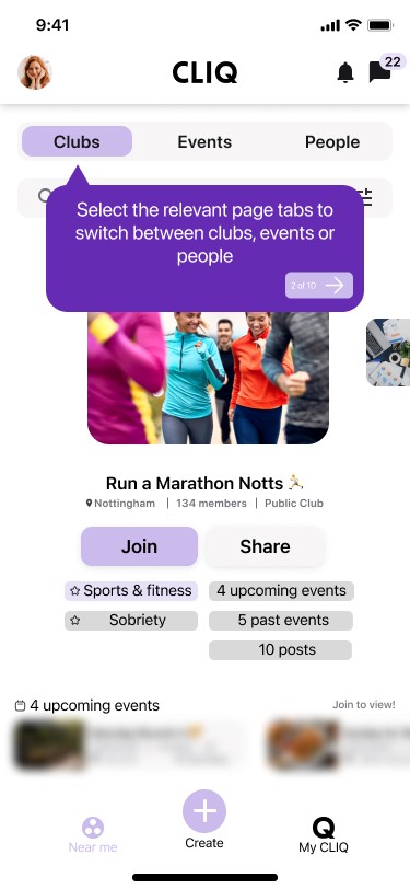

Onboarding 2
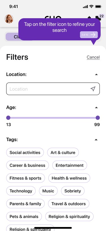

Onboarding 3


Onboarding 4
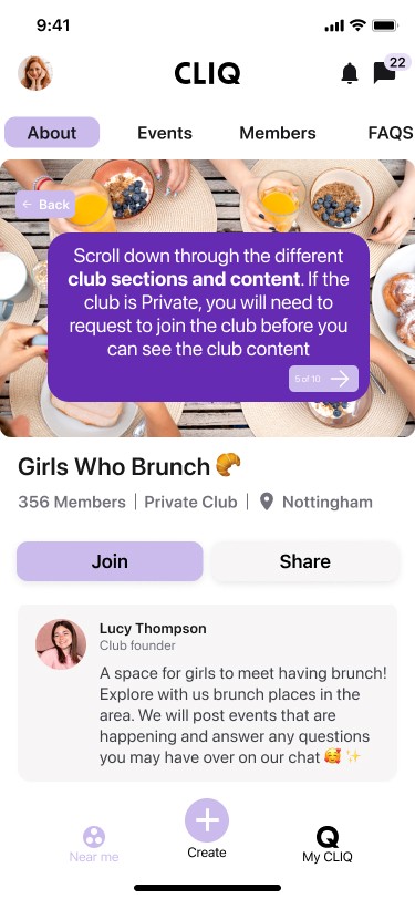

Onboarding 5


Onboarding 6
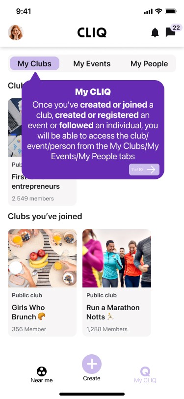

Onboarding 7


Onboarding 8
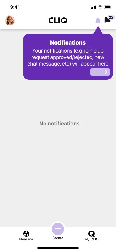

Onboarding 9


Onboarding 10
Before
No explanation on how to use the app

After
Step-by-step guidance walk-through prompts

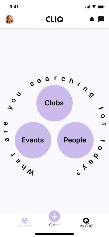

Landing page
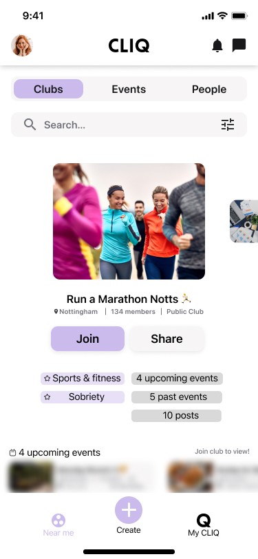

Find clubs
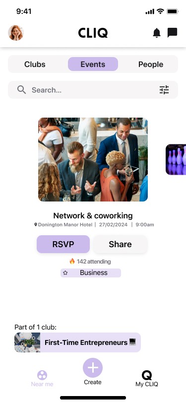

Find events
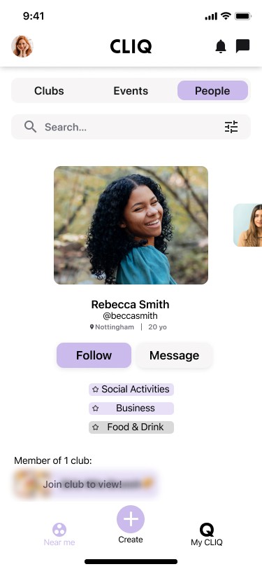

Find people
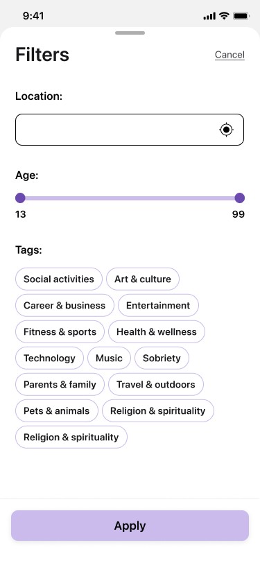

Filter page
(people)*
*New “Near Me” filters initial page provided by CLIQ. Location & age order altered
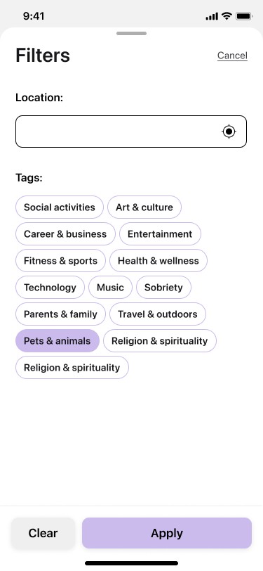

Filter page
(clubs and events)
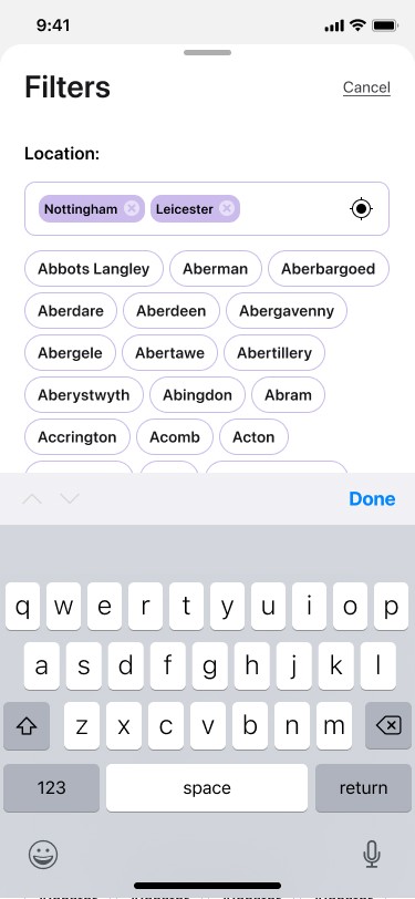

Filter +1 location
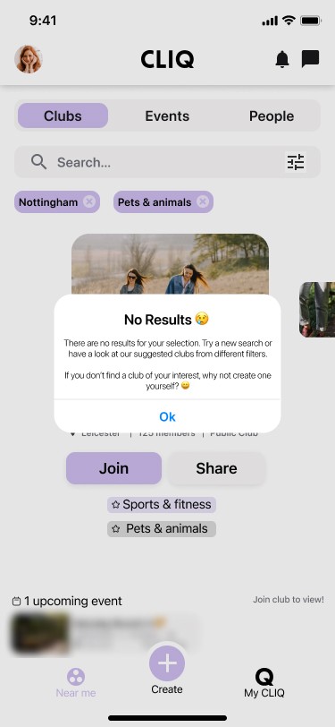

No results notification
Near me
Before
Connects as the first ‘Near me’ page is not useful as the most used ‘Near me’ page is Clubs
“Connects” terminology doesn’t resonate with people
Confusing and overwhelming interface - too much information visible at one time
Duplicate entries for people/clubs/events are annoying
No option to be able to follow people directly from their profile cards
Not enough information about clubs on club cards
No calendar option to display events
Filter results contain results for locations that were not selected
Filter page wording is too small
Age filter is irrelevant in ‘Near me’ Clubs and Events pages
More interests tags required in the filter section
Keyboard covers list of location names in filter section
Can’t select more than one location in filter section
Icon doesn’t indicate when ‘Near me’ page is selected

After
Landing page added for easier navigation
Word “Connects” changed to “People”
‘Near me’ tabs order changed to: Clubs, Events, People
Simple, more concise interface showing one club/event/person on the screen at a time
Interests under clubs/events/people avoids duplicates
Can follow people directly from their profile cards
More information shown on club/event person cards before tapping the cards to see full information
Calendar available to show events
Notifies if there are no results based on the user’s filter selection. Notification suggests selecting from the alternative options shown or creating own club/event
Larger wording in Filter page
Age filter removed from ‘Near me’ Clubs and Event pages
More interest tags available
Keyboard doesn’t cover list of location names in filter section
Able to select more than one location in filter section
‘Near me’ icon indicates ‘Near me’ page has been selected

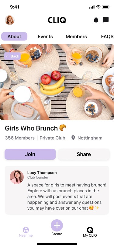

Club home page*
*Club image size changed to take full width of screen was provided by CLIQ
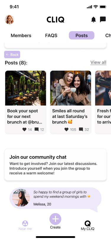

Club home page - private club (info hidden from non-club members)


Club home page - private club (info visible to club members)*
*New “Posts” cards layout in Club home page provided by CLIQ
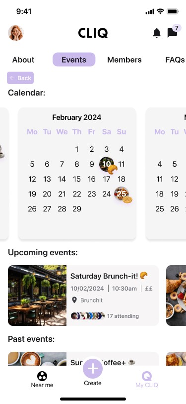

Club events page
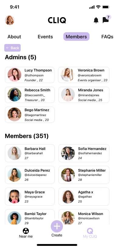

Club members page
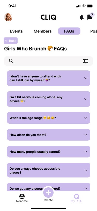

Club FAQs page
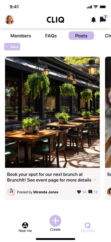

Club posts page
Join a Club
Before
Members and events information from private clubs is visible to non-club members
Join/Share buttons not always visible in Club homepage when scrolling through page
No confirmation notification when you have joined a club
Events can’t be displayed in calendar format
No option for members to post club information other than through the club chats
Not clear how to leave a club

After
Able to hide club/event information in private clubs
Confirmation notification when you join a club
Join/Share buttons always on display in Club home page when scrolling through page (if user is not a club member)
Club admins differentiated from club members
Events displayed in calendar format
FAQs & Posts sections added
Navigation tabs added at top of club pages
‘Join club chat’ prompt is more engaging
Overlay page appears when clicking ‘Joined’ to leave a club

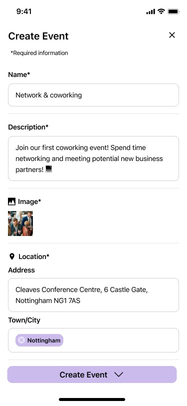

Create Event
(asterisks for
required fields)
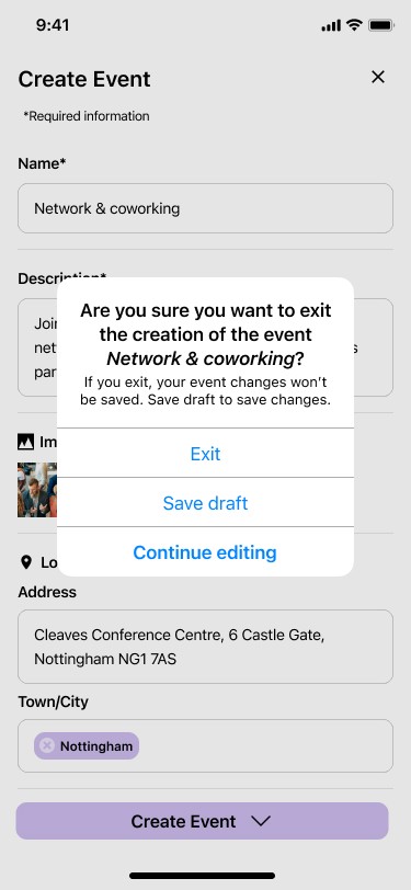

Create Event
(“Are you sure...”
exit pop-up)
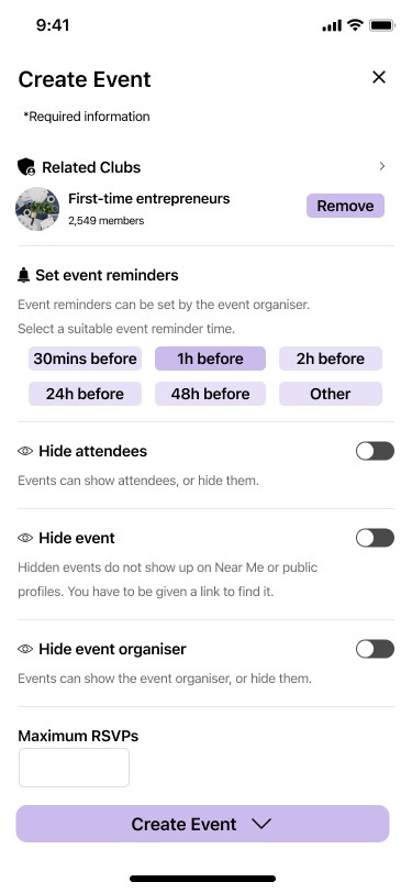

Create Event
(set event
reminders)
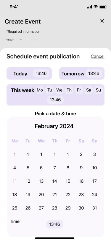

Create Event
(schedule event publication page)


Event page
(location map)


Event page
(show event in calendars)
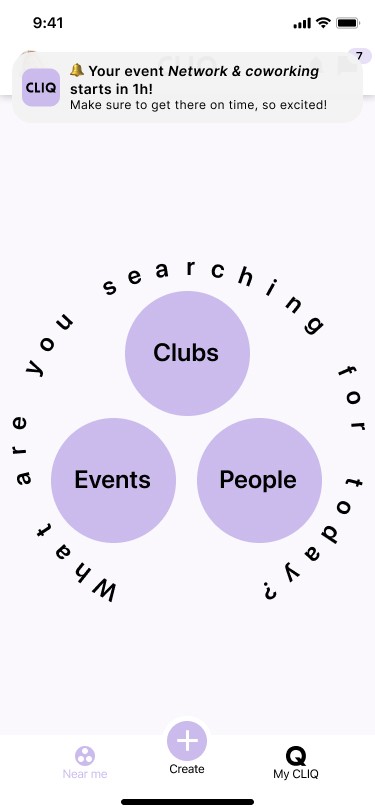

Event reminder notification
Create an Event
Before
No ‘Are you sure’ pop-up when exiting ‘Create an Event’ page
Fields to be completed are separated into 3 tabs which could mean user forgets to complete some necessary fields
Required fields are not indicated and no error message appears informing that necessary fields haven’t been completed until user clicks on ‘Create Event’ at the end
No option to show an event location on a map or as a clickable address link to a 3rd party map app
Duplicate fields exist for location of the event (under ‘Details’ & ‘Tags’)
Not possible to schedule the publishing of an event
No option to include event reminders
Simplify hide attendees/ hide event/ hide authors settings

After
‘Are you sure’ pop-up appears when exiting ‘Create an Event’ page
All fields to complete are on the same page
Asterisks added to all required fields
Map added showing location of event and link 3rd party map apps
One single ‘Location’ field made up of two subfields (‘Address’ and ‘Town/city)
‘Schedule event publication’ option available when creating an event
Event automatically added to My CLIQ calendar after event publication
Option to add event to personal calendar outside CLIQ
Confirmation message added when user has reserved an event
Option to set event reminders added + event reminder pop-up at programmed time
Hide attendees/ hide event/ hide author settings simplified. Hide author changed to hide event organiser

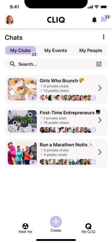

“My Clubs” chat
groups (folders)
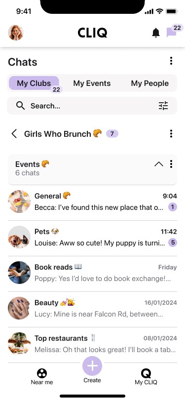

Subfolders & chats


Mute chats
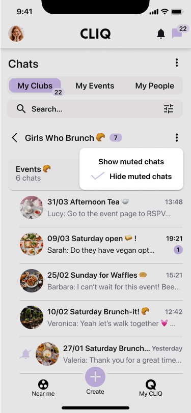

Hide muted chats
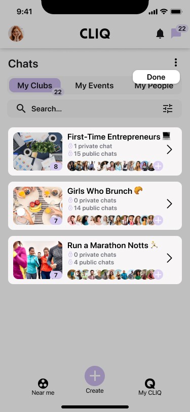

Reorder folders
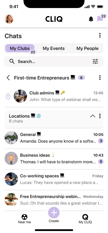

Private chats for admins
Chats
Before
CLIQ header and top/bottom navigation icons are not displayed
Clubs chat page is overwhelming and confusing because it contains chats from all clubs the user has joined or created, mixed together
Can’t mute chats if required

After
CLIQ header and top/bottom navigation icons are displayed
My Clubs chats grouped by club into folders
Subfolders available in each “My Clubs” chat group
Chats can be muted
Muted chats can be hidden
Subfolders can be set as default to be open or closed
Order of “My Clubs” chat groups can be changed
Private chats available for club admins

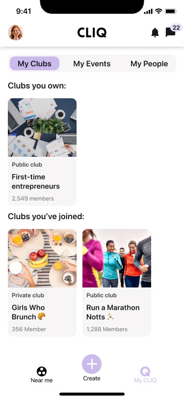

My Clubs
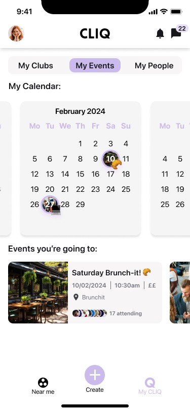

My Events
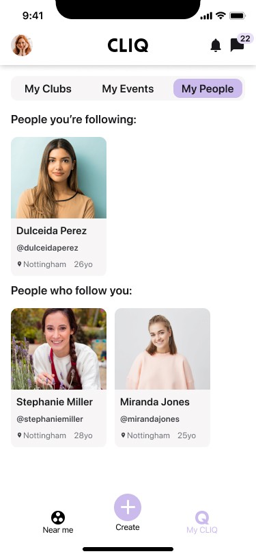

My People
My CLIQ
Before
No personal calendar in the events section
‘Cliq’ lowercase wording in ‘My Cliq’ icon doesn’t match brand logo uppercase wording ‘CLIQ’
No indication that the ‘My CLIQ’ page has been selected

After
Navigation tabs added at top of page (My Clubs, My Events, My People) to match page structure in other sections (Near me and Chats)
Personal calendar added under ‘My Events’
The word ‘Cliq’ in the ‘My Cliq’ icon changed to ‘CLIQ’ to match brand logo
‘My CLIQ’ icon
indicates when ‘My CLIQ’ is selected

Takeaways
The CLIQ app is a relatively new creation and has received very positive reviews from its users since its launch in September 2023. More in depth research has shown however that there are several improvement opportunities that could be taken advantage of to enhance user experience even further and take CLIQ to the next level.
This research, together with a heuristic evaluation and competitor analysis, has resulted in a number of enhanced design proposals for the app, the most significant of which are shown in the final results.
This has been my first UX design case study and has been a very satisfactory learning experience. Lessons learned? If any one stands out, it is the need to focus more specifically on the principal results of the user research to achieve optimum results within an optimum timeframe. Duly noted for future reference!
Testimonial from CLIQ
"I highly recommend Emma as a designer, she has the ability to listen and understand the product easily. She not only understood our requirements but gave amazing feedback, ensuring that the final designs exceeded our expectations. Emma's creativity, and collaborative approach make her an invaluable asset to any team!"
Jason Illife
CLIQ founder
